OasePark redesign gives the Dutch city parks directory a calmer field-guide look
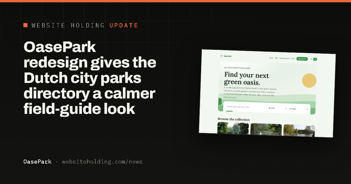
OasePark, the directory of city parks and green spaces across the Netherlands, moved to a calmer field-guide design with a botanical hero, a warm serif, and its bilingual search kept front and center.
OasePark refreshed the design of its Dutch city parks directory at oasepark.nl. The homepage now opens with a calm botanical scene of soft green hills and a low sun that settles into place on load, so the first impression is stepping into a green space rather than opening a search tool.
The green palette the site is known for stays exactly as it was. What changed is the mood: a warm bookish serif for headings, more generous spacing, and a single gentle reveal instead of a busy screen. The bilingual search for parks, gardens and cities still sits right at the top, resting on a raised card over the scene.
Everything else works as before. Browse city parks, pocket gardens, forests and nature escapes in Dutch and English, filter by city or type, and save your favourites. Find your next green break at oasepark.nl.